Charts for a Recurring/Subscription Business
These charts are for any company who advertises online and charges a recurring fee.
I previously wrote a short guide on what data you need to start analysing your e-commerce marketing spend (or measure your online sales in greater detail).
Those charts were suitable for companies who don't sell subscriptions online, for example online clothes retailers. But what if you charge your customers a monthly fee, like Netfix or Spotify? You'll need different charts for that type of company, but what should they be?
To help you with this, I've created some more sample charts that are aimed at subscription or SAAS (Software as a Service) companies, but anyone who advertises online and who charges a recurring fee can use it too.
What are the charts for?

You can view and download the charts here.
The charts visually answer a number of questions, some of which are the same as those for a company that doesn't do recurring payments, but some are specific to this type of business model.
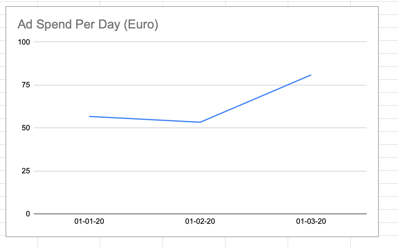
- How much do I spend every day on ads?
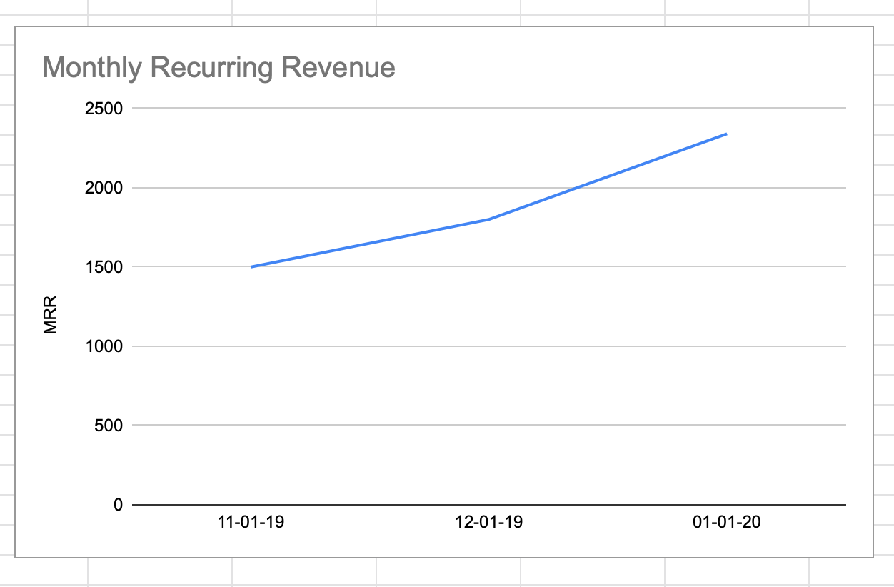
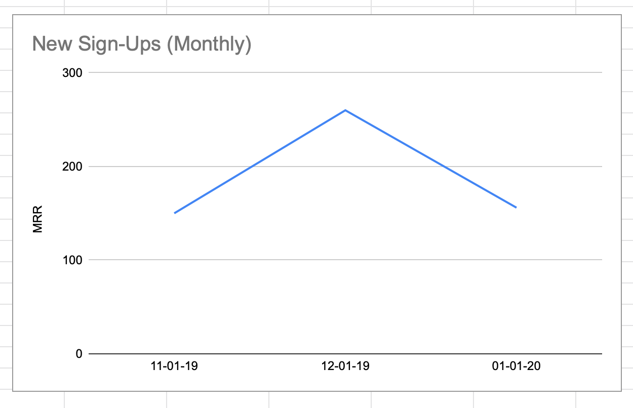
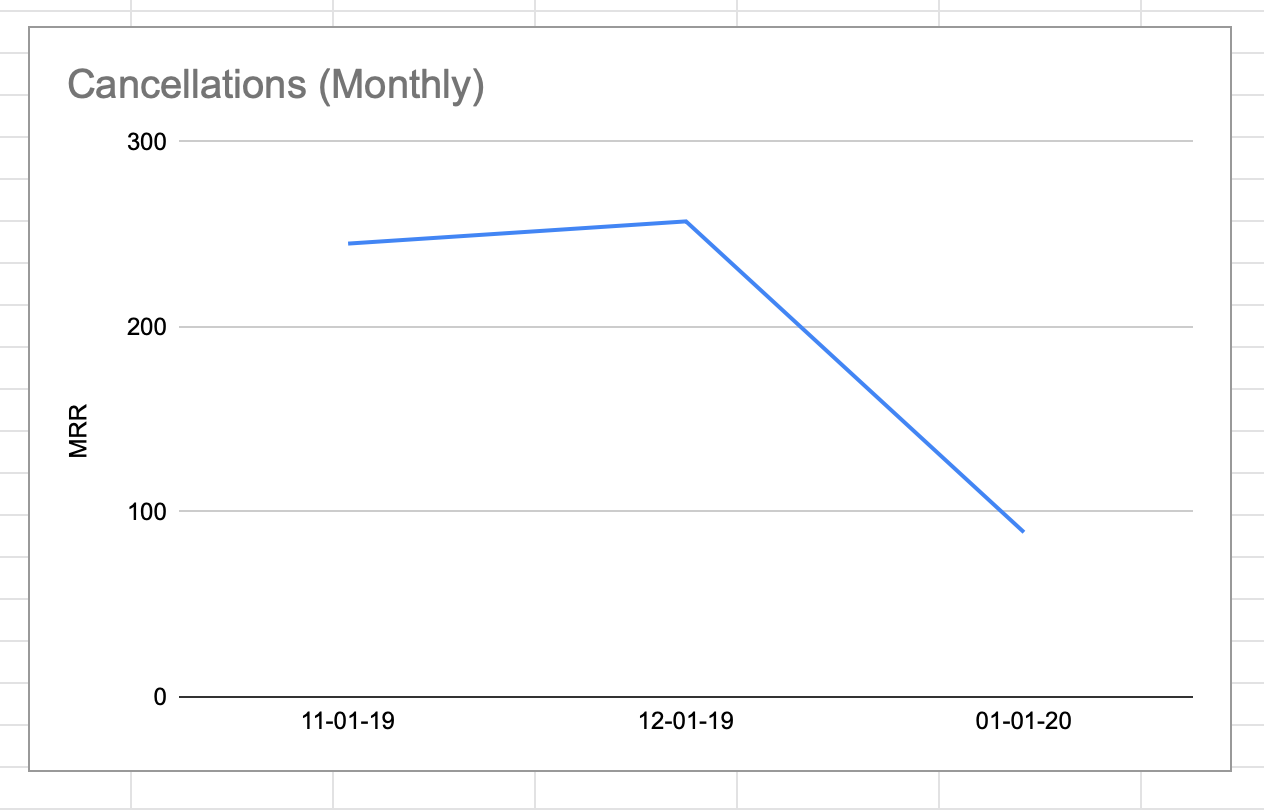
- What’s my monthly/annual/periodical recurring revenue? Is it growing or shrinking?
- How many customers did I add/lose in this period? Did anyone upgrade or downgrade if I have multiple plans?
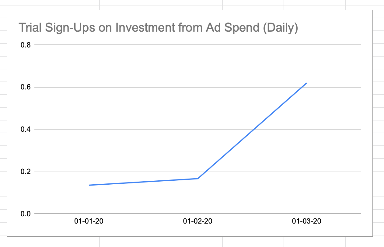
- What is my return on investment for the money I spend on ads - i.e. for every $1 I spend on ads, how much do I make in sales? How many free trials (if I have trials) did I get this period?
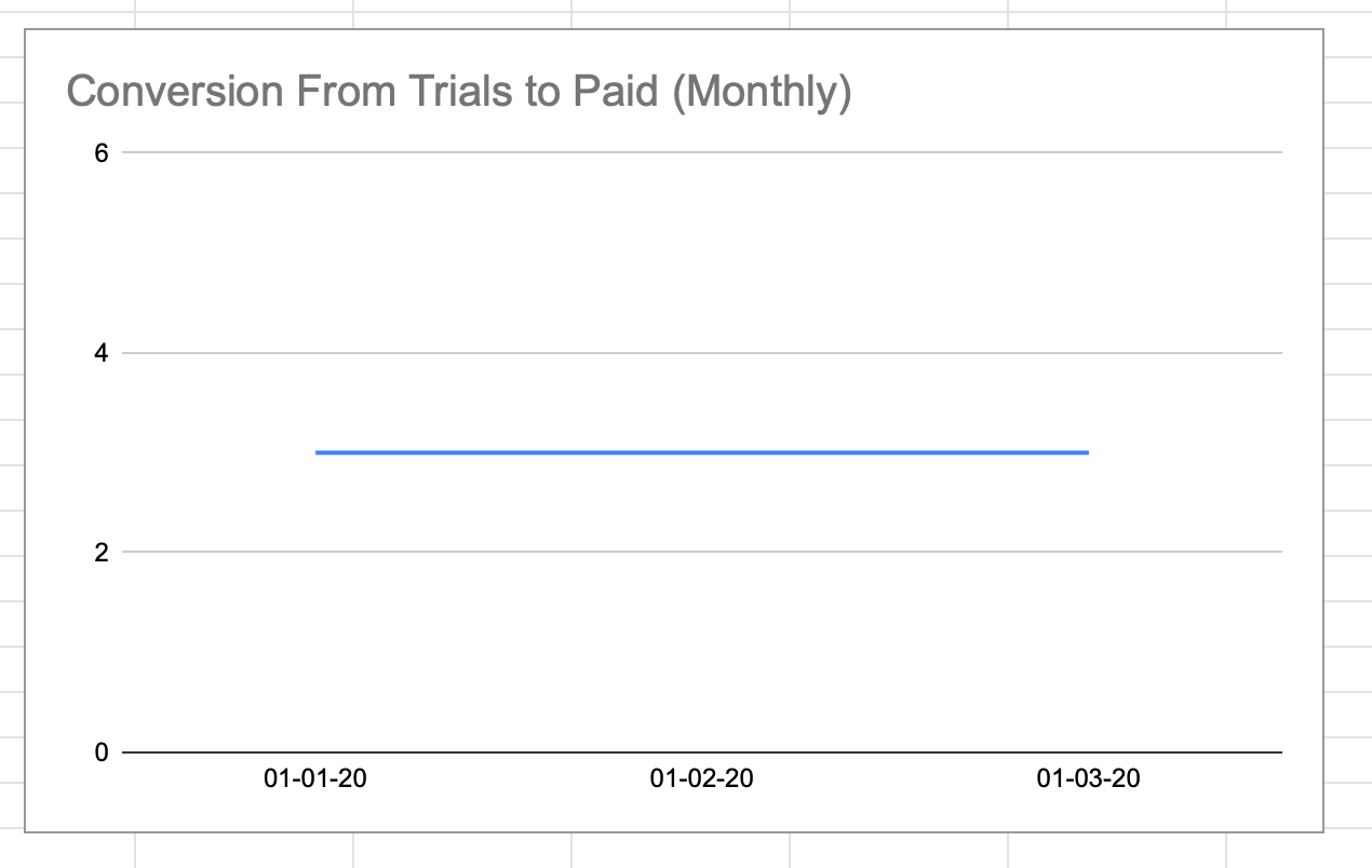
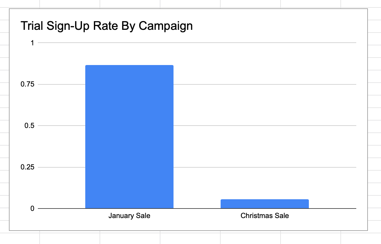
- Do I have a free trial for my service? If so, how many convert from free trials to paid users? Does this vary by ad platform/campaign/device/plan?
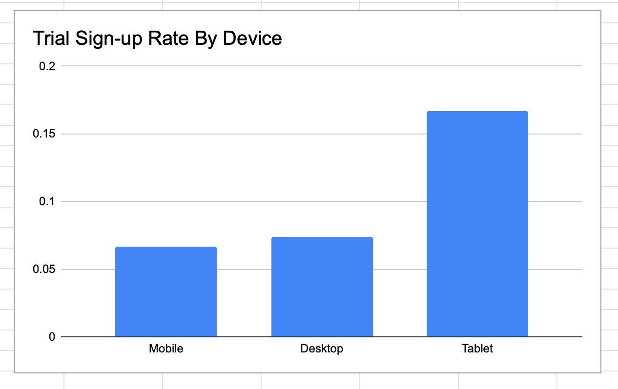
- I advertise on mobile, desktop and tablets. Do they all perform the same for the above questions?
- What’s the conversion rate on my site - i.e. for every 100 people that visit my site, how many buy something/sign up for my product or service?
Why these questions?
Simply put, you can tell quite quickly whether a business is growing/struggling and what the drivers of growth/decline are from a marketing and sales perspective. Obviously, there are other charts and analyses you could conduct. There are also business models where the transaction doesn't take place online, but you're still charging a recurring fee - for example a large corporate deal for software licences - but you can always extend these charts to include such data if you need it.
What sort of data is needed and where do I get it?
The data should come from three places:
- The platforms you’re advertising on (Facebook ads, Google Ads, email);
- Your own site analytics (using Google Analytics or similar);
- Your payments system, like Stripe or Paypal, if you have one.
There is a little setup required for this, so get in touch if you need help - I’ve done it for many companies. Most platforms allow you to download the data you need as a spreadsheet. You can also extract it via the platform API (if you don't know what that is, that's ok, start with the spreadsheet download instead) - which is preferable if you've a lot of data. I've used both, but the API provides more detailed data, so I prefer that. However, you'll need an engineer to get that data for you.
The data you need is the following:
- Day - the day of the ad spend/sales - your ad platform and your site analytics dates should match.
- Device - Broadly, this should be desktop, tablet and mobile. Ideally, your ad platform and your site analytics device names should match exactly. However, some platforms use different terms (Facebook might use the term mobile while Google might use 'mobile device', for example) so you may need to check on this first.
- Campaign - You may only have one ad campaign, in which case, this isn’t as important, but if you want to compare your January 18-24 Year-olds Campaign to your January 25-30 Year-olds Campaign, you need to set up separate campaigns and then add parameters to your URLs so that your site analytics can properly identify where customers are coming from.
- Impressions - from your ad platform - how many people saw your ad.
- Clicks - from your ad platform - how many people clicked on your ad and visited your site.
- Ad_Spend - from your ad platform - how much money you spent (by day, device and campaign if possible).
- Website_Visits - from your site analytics - how many people clicked on your ad and visited your site (by day, device and campaign if possible).
- Trial_Sign_Ups - from your site analytics - how many people from the group above (Website_Visits) started a free trial (if you have such a thing). This could also be a paid sign-up. You may need to set up a goal in Google Analytics to track this.
- Free_Trials_Rate - this is a calculation of signups/website_visits - If 100 people visit your site and 4 people sign up (or do some other goal on your site), that’s a 4% conversion rate. There are other ways of calculating your conversion rate but this is decent general metric to get you started, if you’ve never done it before.
- MRR - From your payments provider or internal systems - Monthly Recurring Revenue.
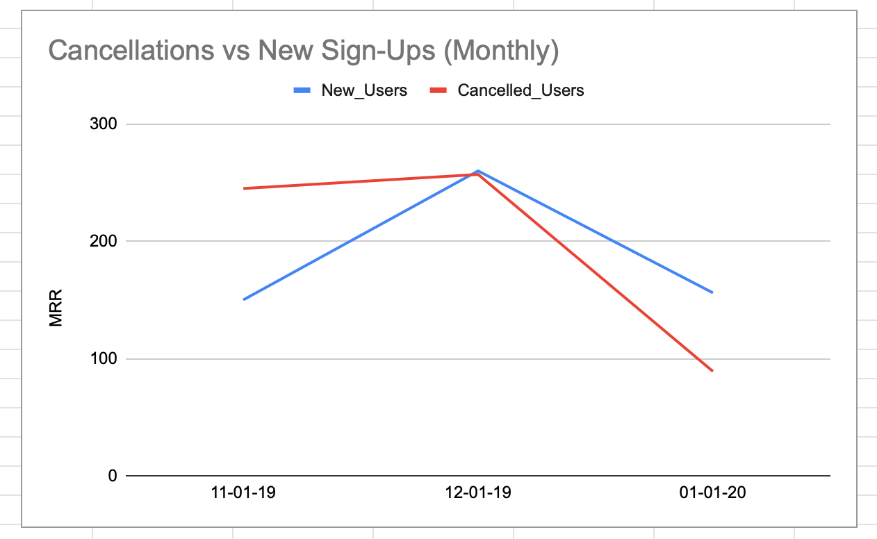
- New_Users - From your payments provider or internal systems - How many new users for that month/period did your company sign up.
- Cancelled_Users - From your payments provider or internal systems - How many users cancelled their subscription for that month/period.
- Plan_Upgrades - From your payments provider or internal systems - How many users upgraded their subscription to a different plan for that month.
- Plan_Downgrades- From your payments provider or internal systems - How many users downgraded their subscription to a different plan for that month.
How could I extend the charts?
- Move the data from an excel sheet into a database like MYSQL, or a cloud provider like Google Sheets.
- Connect a visualistation tool like Tableau to make creating and presenting the charts easier.
- With more data, you could start looking at things like LTV (Life Time Value) of customers and what customers are your most/least profitable - do they come from specific marketing channels, for example.
Feel free to use the charts above as a starter for your own company but if you need a little more assistance, just get in touch and I’ll help!