Charts for Businesses with Memberships
A short guide on how to build dashboards for companies with memberships.

Continuing on the theme of different analytics charts for different types of companies, I've created some for those who run businesses with memberships. These charts could combine with the subscription business charts I created previously as well.
These data and charts are focused particularly on new memberships but could be applied to existing memberships too, giving you more data and insights that way. Get in touch if you need assistance with this!
You can view the charts and download the file here.
The main questions these charts answer are:
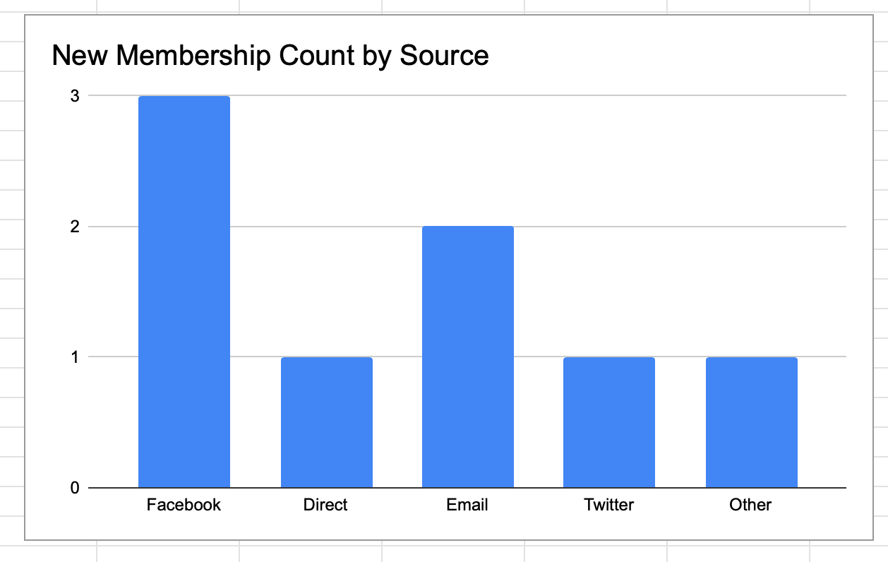
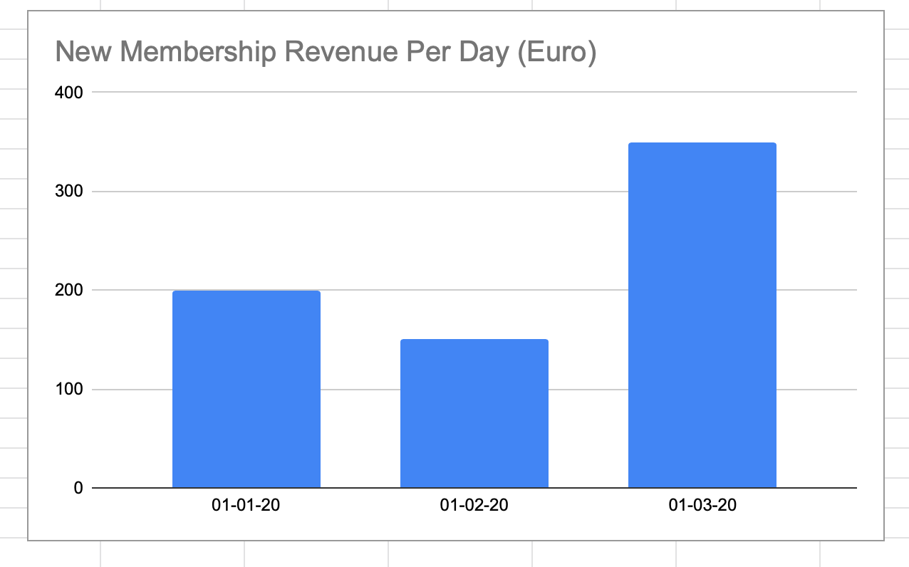
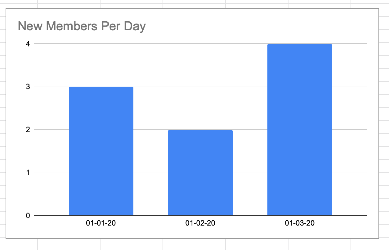
- How many new members a day do I get?
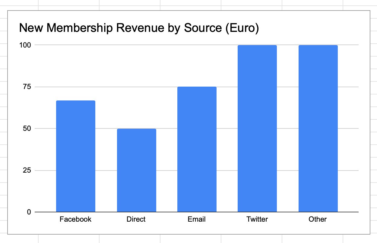
- What’s my daily revenue from these new members?
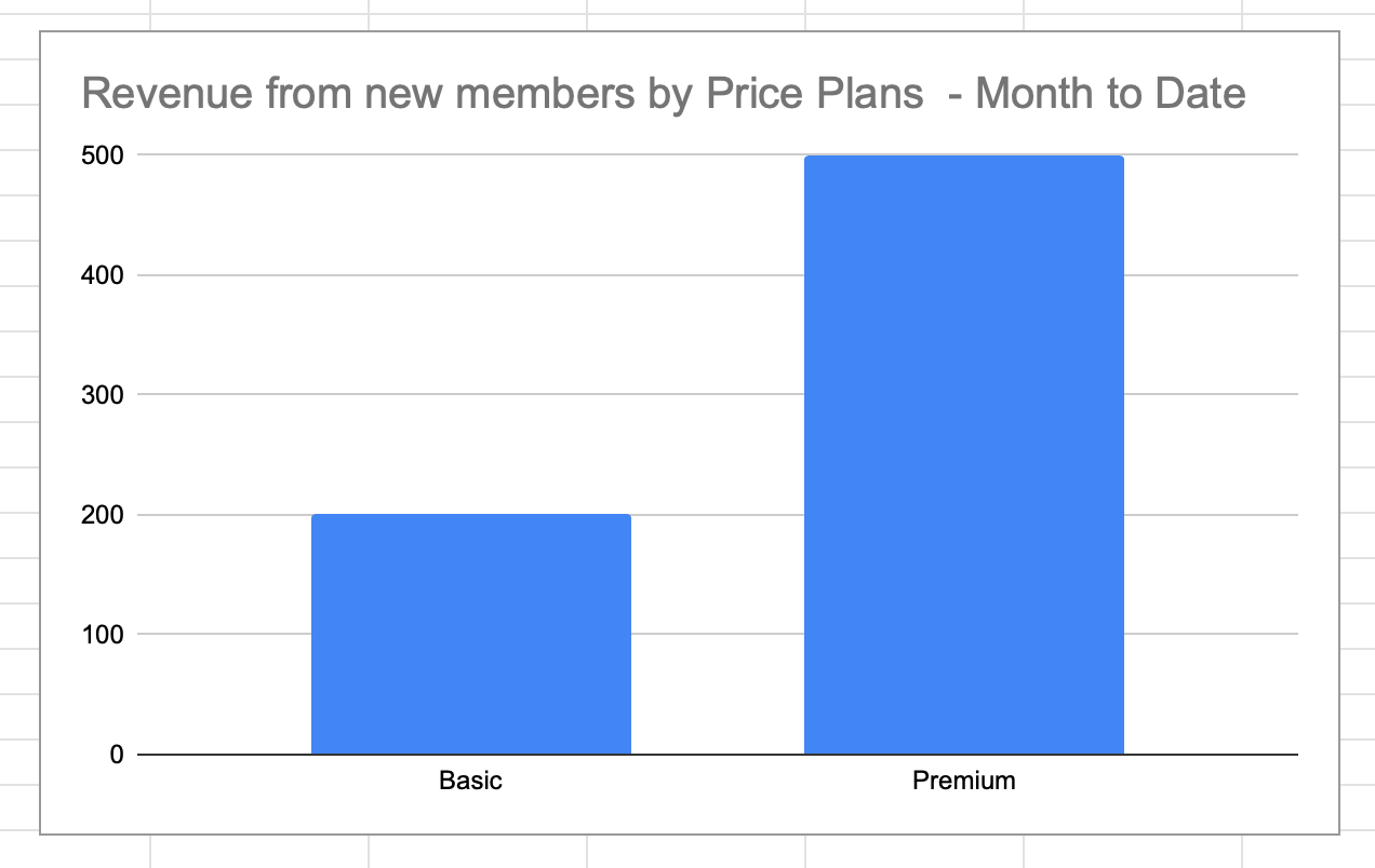
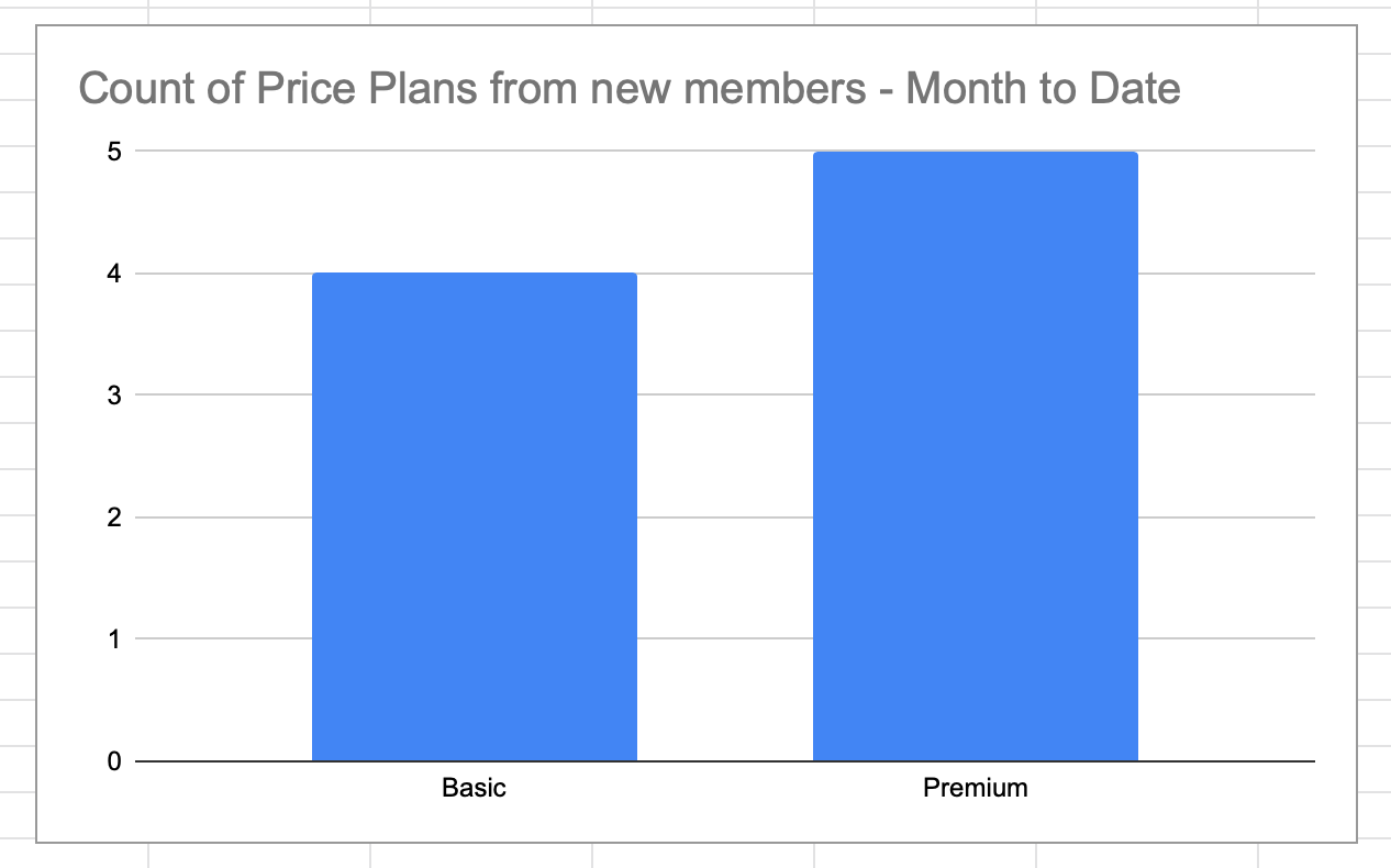
- If I have different plans, what’s the split in new revenue/membership relative to these plans? Does a higher priced plan bring much more revenue relative to a cheaper one?
- Do different sources bring in different users? For example, does Facebook bring in a different user (in price, user type, …) to Email? Where do most of my new members come from?
What sort of data is needed and where do I get it?
The data should come from three places:
- The platforms you’re advertising on (Facebook ads, Google Ads, email);
- Your own site analytics (using Google Analytics or similar);
- Your payments system, like Stripe or Paypal, if you have one.
There is a little setup required for this, so get in touch if you need help - I’ve done it for many companies. Most platforms allow you to download the data you need as a spreadsheet. You can also extract it via the platform API (if you don't know what that is, that's ok, start with the spreadsheet download instead) - which is preferable if you've a lot of data. I've used both, but the API provides more detailed data, so I prefer that. However, you'll need an engineer to get that data for you.
Data Fields Needed:
- Name
- Sign_Up_Date - From your payments provider or internal systems - the date the user signed up. This could be a trial or they may have paid immediately.
- Plan - From your payments provider or internal systems - the cost of the plan the user signed up for, This might be a one off or recurring price.
- Plan_Name - From your payments provider or internal systems - the name of the plan the user signed up for.
- Sign_Up_Source - From your payments provider or internal systems - how your user came to your site and signed up: social media, email and so on. This could also be in Google Analytics
How could I extend the charts?
- Move the data from an excel sheet into a database like MYSQL, or a cloud provider like Google Sheets.
- Connect a visualistation tool like Tableau to make creating and presenting the charts easier.
- With more data, you could start looking at things like LTV (Life Time Value) of customers and what customers are your most/least profitable - do they come from specific marketing channels, for example.
Feel free to use the charts above for your own company but if you need a little more assistance, just get in touch and I’ll help!
You can view (and download) the charts here too if you want to use it (for free).